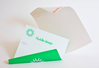
New identity for Huddle Design, the brainchild of A Friend Of Mine. I think that the H works really effectively as a mark the use of a varied colourset really brings a playful feel to the identity which is lost a lot of the time in corporate, two colour identities. My on criticisms would be that I don't think the typography is working as well as it could and it doesn't feel like the layouts have been as considered as much as they could be, some of the elements feel to be floating a bit.
Subscribe to:
Post Comments (Atom)


No comments:
Post a Comment