


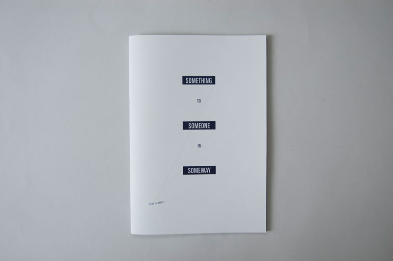


Really like the centered aligned text up at the top. It's almost "breaking the rules" of traditional typography but it represents a growing trend at the minute I'm seeing quite a lot of designers doing it and I think it has a really contemporary feel. The type over the space images looks great and the cut off page without the Bin book works really nicely on that hardboard-esque stock.

No comments:
Post a Comment