
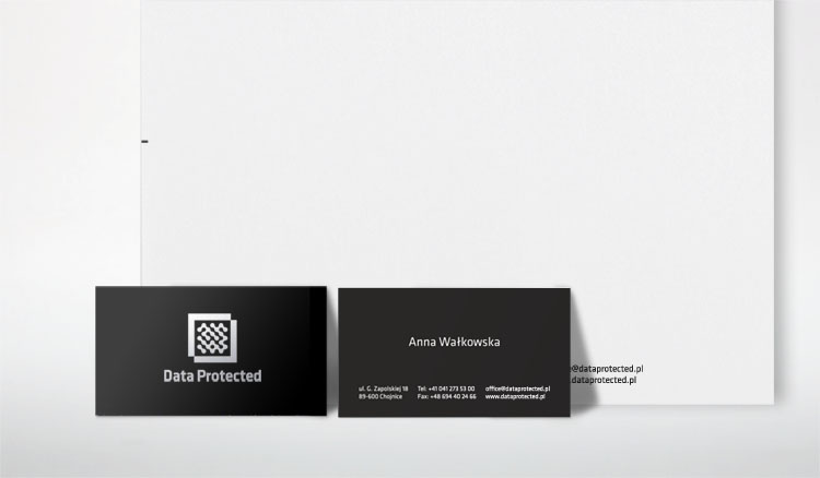

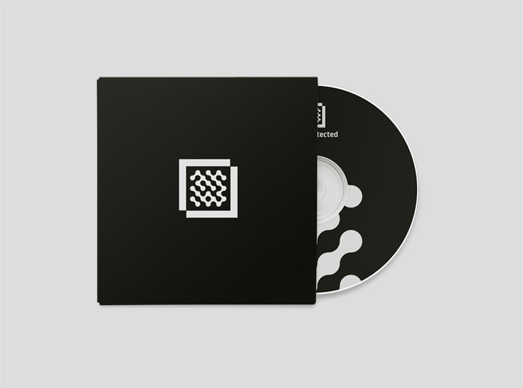
Really great identity for an It company, carries that feel of microchips and "digital-ness" but without looking digital in too literal a sense. The graphic icon is a great representation of a chip and the simplicity of the whole idea, carried through by the simple black and white creates a real executive and professional feel.

No comments:
Post a Comment