4.6.10
Context Books Printed
3.6.10
Weiss-Heiten
Greati printed work here from German studio Weiss Heiten. I think that their choices of limited colour palettes and informed materials choices really create an instant sense of quality and impact in the work, some of the typographic treatments are also beautifully put together.
Thomas Groeger & Berni Valenta
Simple but beautiful book designed for Carhatt. The inner layouts use a text across a variety of different column widths which I think has been done in a very considered and effective way. The strongpoint for me is the front cover which features a beautiful emboss as well as black foil on lovely looking material.
Stockport Uni
At Stockport Uni this year graduates are putting together a movable exhibition which they are driving in a van to different agencies round Manchester, I think this is a great and innovative way of holding and end of year exhibition and the brandinf they have done for it is great, a particular highlight for me is this great custom printed tape which that are wrapping everything with.
Mr L'Agent
Beautiful typography and layout work from Mr L'Agent. I think that the monotoned images and some of the overlapping elements work really effectively together to create an artistic but still considered and functional aesthetic.
Jung & Wenig
Beautifully stylish and multi-formatted book/zine. The bright yellow paper really brings the print of the photographs to life and makes them really impactful whilst keeping the lofi feel that is so important to these kind of projects. I think that the typography on the front cover id beautifully considered,
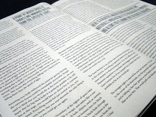
James McCarthy
Lovely large scale book about space/science and black holes. I think some of the infographical elements have been a great success especially when the diagram is working with the type as one. It might have been nice to see what some controlled colour could have done in the project but I still think it looks really interesting and very executive in black and white.
Subscribe to:
Comments (Atom)


