Showing posts with label Colour. Show all posts

3.6.10

Weiss-Heiten


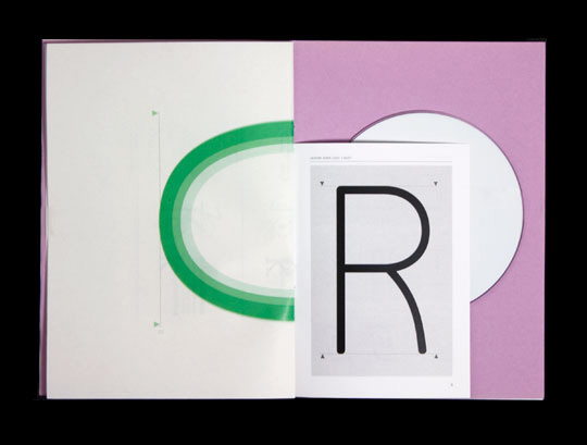
Greati printed work here from German studio Weiss Heiten. I think that their choices of limited colour palettes and informed materials choices really create an instant sense of quality and impact in the work, some of the typographic treatments are also beautifully put together.

Happy Forsman & Bodensfors


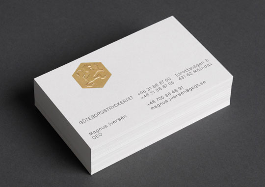
Great branding and promotional work for another printing press. The logo type is very imperial and classic but the way is has been treated in the really bright colours gives quite a fun and retro feel. The hexagonal rather than cylindrical tubes are also a great idea which carries the brand beautifully across the packaging.

16.5.10

Thompson Brand Partners


Great identity work for Metal, an artists residency in Liverpool. I think that the die cut really complements the typography, really industrial. The spot colour has that ultra bright wow factor which means that anything printed with is is just going to jump out at you amongst other printed matter. Definitely a good choice if you're doing something that you want to be loud. This project I think is really successful because it can carry this extremely bright colour but without being garish, still looks really professional.

Nikolaus Schimdt


Great annual report designed by Nikolaus Schmidt. Looks really similar to the first Unit Editions newspaper but definitely works in this application as well. The whole thing works really well in two colours and I think that the simple linear illustration creates a creative and fun feel to a document that could otherwise be quite bland, but still keeping a very professional aesthetic look. I also like the combination of layouts with left aligned and centered sections of text. Almost similar to certain high end fashion magazines that are coming out at the minute.

Base


Base have just completed some new work to accompany the new Pantone Plus range. The brand for Pantone must be one of the strongest around, it's so solid and perfect for the company. I really like these 3D installations as I think that they're a great representation of the brand identity in an innovative way, really playing on the angular nature of the window brand.

11.5.10

Sara Berks


Really nice set of type books from Sara Berks, lovely die cut hardboard cover. that leaves out little sections were the type shows through. Nice to have them colour coded as well.

Helmo


Great work from Helmo in Paris, a lot of really large scale screen printing which is great to see documented and so beautiful use of overprinting colours. Really like to see how they can translate their screen printing roots into smaller applications, keeping the hand printed aesthetic but in a more mass produced and coorperate way.

Design Studio


Really nice work from Design Studio. They seem to have quite a unique way of mixing traditional and very contemporary styles which makes a really interesting aesthetic. I also really like the way they deal with colour, they mix some colours I'd usually be wouldnt put together but they get away with it really well. I think wie haben das gemahct is 'what have you made?'

Antonio Carusone


Beautiful poster here by Antonio Carusone. It's being receiving a lot of praise on different design blogs and for good reason I think. The tube maps and its typography have such a a beautiful visual language and I think this has been displayed really beautifully here, it's been translated from a great info graphical style into a great promotional poster.

Akatre


Great typography, layouts and different sections of monochromed images here. putting together picking out different sections on the photographs with splashes of colour has really worked well. Really like how the typography matches the shape of the illustration.


25.4.10

Studio Lauke Siebein


Invitations for events at Gallery Space ScheiblerMitte. Again these invitations carry a really classic swiss or dutch feel with the large scale helvetica typography overprint with bold and offset patterns or with photography, heightened even more by the red and blue colour choice. This style is definitely in the middle of a big revival at the minute, some people might argue its never gone away but I think that simple and clean design that almost looks designed and printed by hand is definitely back on top of overly digital efforts that might have been more championed in the 90's.

Studio Aad


Studio Aad have just done the lookbook for fashion label Arms. I've not seen many images from the inside pages but I thought that the idea for the cover was great, the little die cut whole create a really effective piece of typography and also a sneak peek onto the first page. I also think that the simplicity of the idea lends itself really easily to work across a range of bright colours. The matt, uncoated stock was definitely a good choice for this project.

Jongemeesters


Jongemeesters, based in Amsterdam have just done this work to promote the Holland Dance Festival. The project carries a distinctly dutch feel to the work, while still being quite progressive and very contemporary, I think a lot of this is down to the brave colour choices which I think have worked incredibly well, the posters will just jump off the wall at people but not in a garish way. Really good work. The pattern carried across onto the spine of the work is a really classy finishing touch which just adds that wow factor to the project.

Almost Modern


Almost Modern, based in the Netherlands have just released their new business cards. I think these are great, the colour and typography really work with one another and I love the idea of the message on the front, really suits their brand.

A Friend Of Mine


New identity for Huddle Design, the brainchild of A Friend Of Mine. I think that the H works really effectively as a mark the use of a varied colourset really brings a playful feel to the identity which is lost a lot of the time in corporate, two colour identities. My on criticisms would be that I don't think the typography is working as well as it could and it doesn't feel like the layouts have been as considered as much as they could be, some of the elements feel to be floating a bit.

21.4.10

Glasfurd & Walker


This work from Glasfurd & Walker is quite simple and almost quite commercial in its looks. I don't think that the contents page works very well but what really stood out to me was the other pages I really like the combination of the numbers sitting very neatly inside the margins and then breaking right out of the frame, the colour choice also looks great, the blue and purple compliment each other.