Showing posts with label Packaging. Show all posts

3.6.10

Happy Forsman & Bodensfors


Great branding and promotional work for another printing press. The logo type is very imperial and classic but the way is has been treated in the really bright colours gives quite a fun and retro feel. The hexagonal rather than cylindrical tubes are also a great idea which carries the brand beautifully across the packaging.

&Smith


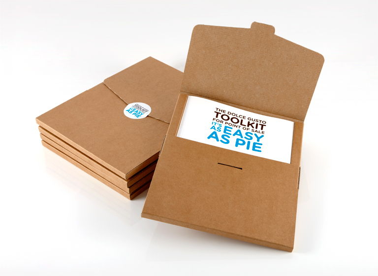
Reallt strong work from &Smith for a coffee maker. The rawness of the cardboard really suits the context of real coffee beans aswell as fitting the colour, I can imagine going really well with some uncoated stock.

16.5.10

Traffic


Beautiful record sleeve design by traffic for filthy dukes. Really simple and geometric illustration. It's simplicity and great colour is what makes it so effective I think. I like how the eye illustration is completely as simple as it could be, very symbolic and almost masonic 'all seeing eye' with all the lines emitting from the center. Really simple idea to print the eye onto the actual vinyl but just adds the cherry on top to the experience.

Li Inc


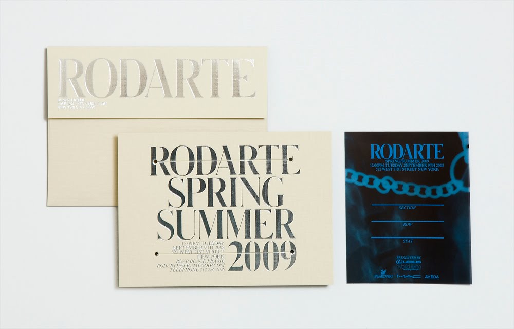
Really strong work from Li, Inc. The white screen printed bag looks great, I think that the almost transparent white ink sits really well on the clear plastic and shows of whats inside really effectively. The Alexandra Wang items I think are incredibly simple but work really well in particular the swing tag. I think that the type on the Rodarte items looks great and the half inverted out colours on the red piece is quite retro but definately successful.

11.5.10

Dan Contrell


Beautiful CD packaging idea from student Dan Contrell. The package is put together with the inside strip of a christmas cracker so that when it's opened it snaps and makes a bang. Love the idea of having an event when something is opened once that can only happen once. Really like the minimal design of the front panel aswell, just showing off the strip, looks really tempting.

21.4.10

PNTS


Absolutely beautiful packaging and poster work here for RIEN by PNTS. A lot of people have used the astronomical aesthetic over the last year to a varying degree of effectiveness but I think this is an example of it done extremely well, the constellation shapes and the pastel coloured stock complement with sheer black and white sections really well and the layout of the poster works really well with the long thin section running down the center the guides you down to the logo and text.

21.3.10

David Bailey Ross


Really beautiful shape and colour work on this record sleeve. Bailey Ross designs under the moniker GOODBOY. This was featured on the Creative Review blog. Has a really classic feel.

20.2.10

Studio Makgill


There's a lot of people doing really nice stuff in plastic wrap at the minute, seems to be quite fashionable. Really good type work and colour on this.

Sawdust


More great work from Sawdust.  Can't fault any of it, great colour work, shapes of the vinyl labels are great and I'd love a warsaw shirt.

Nick Gill & Daley Walton


Screen printed CD packaging, got featured on the Creative Review blog. I really like that the whole thing has been screen printed by a member of the band. Creates a personal touch which transcends the CD into a piece of memorabilia, the bag is also a really nice touch, useful research for my Spazz compilation.

18.1.10

Xavier Encinas


Mailout
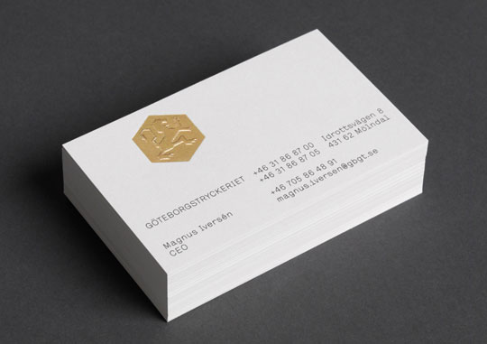
Strengths - this thing is so simple but the illustration I though created a character that the gold foil really sets of, keeping this thing so simple has really put emphasis on the foiling which I think is a nice touch.
Weaknesses - I feel like maybe this has just been left too simple, it look unfinished. I like that emphasis has been put on the foiling but I don't really feel like its enough, I think that there could have been more exploration into the materials used as well.

Designers Republic


Packaging for Autechre - 'Oversteps'
Strengths - Simple colour palette is really bold and will stand out on a shelf. The circle design is also really interesting, almost reminds me of the scale circle prints blanka did. The circle represents so many thing as well as a record which can be really nice when associated with music to do with everlastingness and balance. The over printed black text also works really nicely. Almost a hark to the Spiritualized stuff Farrow did.
Weaknesses - The tone of black looks like it varies slightly from item to item as the stock changes. Also not sure if I like the messy edges to the circle.

Build - Generation Press


Build are ten anniversary pack
Strengths - Also for the Generation Press tenth anniversary Build have designed and put together this pack featuring work from Sanna Annukka and John O'Rielly. The over printing has worked really nicely and really communicates the essence of a printing press.
Weaknesses - Doesn't really fit in the with identity that Build have made for the rebrand of the press.

26.12.09

Ill Studio


Ill Studio have just done a rerun of this mix CD as it sold out last time, it's such a nice package, really simple one colour printing with great use of that black bubble wrap on the outside.

14.12.09

Morse Studio


These business cards by Morse Studio are great, they're so simple and they show why the effective use of a spot colour can really big work to life, that red is so bright it means that business card is going to stand out from so many other ones.

17.10.09

//DIY


Such a versatile designer, great innovative ideas with packaging, illustration and typography