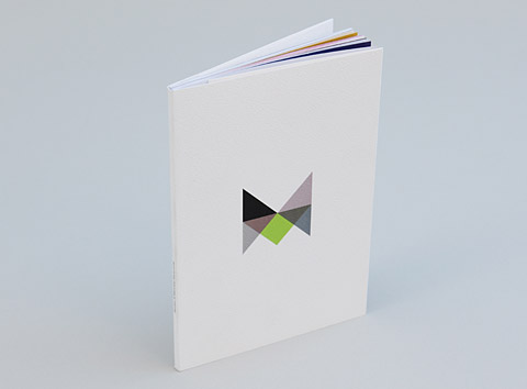
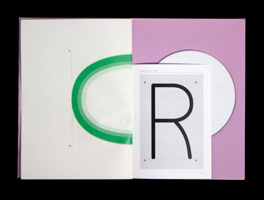
Simple but beautiful book designed for Carhatt. The inner layouts use a text across a variety of different column widths which I think has been done in a very considered and effective way. The strongpoint for me is the front cover which features a beautiful emboss as well as black foil on lovely looking material.
Showing posts with label Layout. Show all posts
3.6.10
Mr L'Agent
Beautiful typography and layout work from Mr L'Agent. I think that the monotoned images and some of the overlapping elements work really effectively together to create an artistic but still considered and functional aesthetic.
Jung & Wenig
Beautifully stylish and multi-formatted book/zine. The bright yellow paper really brings the print of the photographs to life and makes them really impactful whilst keeping the lofi feel that is so important to these kind of projects. I think that the typography on the front cover id beautifully considered,
James McCarthy
Lovely large scale book about space/science and black holes. I think some of the infographical elements have been a great success especially when the diagram is working with the type as one. It might have been nice to see what some controlled colour could have done in the project but I still think it looks really interesting and very executive in black and white.
&Smith MTV
Beautifully bound book for MTV also by &Smith, the colour choices and layout are quite experimental and very of the moment which fits the target audience perfectly.
16.5.10
Vast
Nikolaus Schimdt
Great annual report designed by Nikolaus Schmidt. Looks really similar to the first Unit Editions newspaper but definitely works in this application as well. The whole thing works really well in two colours and I think that the simple linear illustration creates a creative and fun feel to a document that could otherwise be quite bland, but still keeping a very professional aesthetic look. I also like the combination of layouts with left aligned and centered sections of text. Almost similar to certain high end fashion magazines that are coming out at the minute.
ICO Design
Calum Crease
12.5.10
Untitled Studio
11.5.10
Matt Ellwood
Beautiful digitally printed posters with added screen printed glow in the dark ink. Great way of sending a message and fits the concept of light pollution perfectly. Finished off really nicely by using elements of the type to change how it reads depending on the light or dark.
Helmo
Design Studio
Really nice work from Design Studio. They seem to have quite a unique way of mixing traditional and very contemporary styles which makes a really interesting aesthetic. I also really like the way they deal with colour, they mix some colours I'd usually be wouldnt put together but they get away with it really well. I think wie haben das gemahct is 'what have you made?'
Subscribe to:
Posts (Atom)


